Disclaimer : I do not ownership images use on the design layout. Images are only for inspirational purposes
Conference Poster
This poster was designed for TYPO(International Design Talk) conference 2013. The theme was Contrast. My design was inspired by the geometric shape inside the letter "T". Red and black colors work together to create negative space in the whole composition.
You may also like
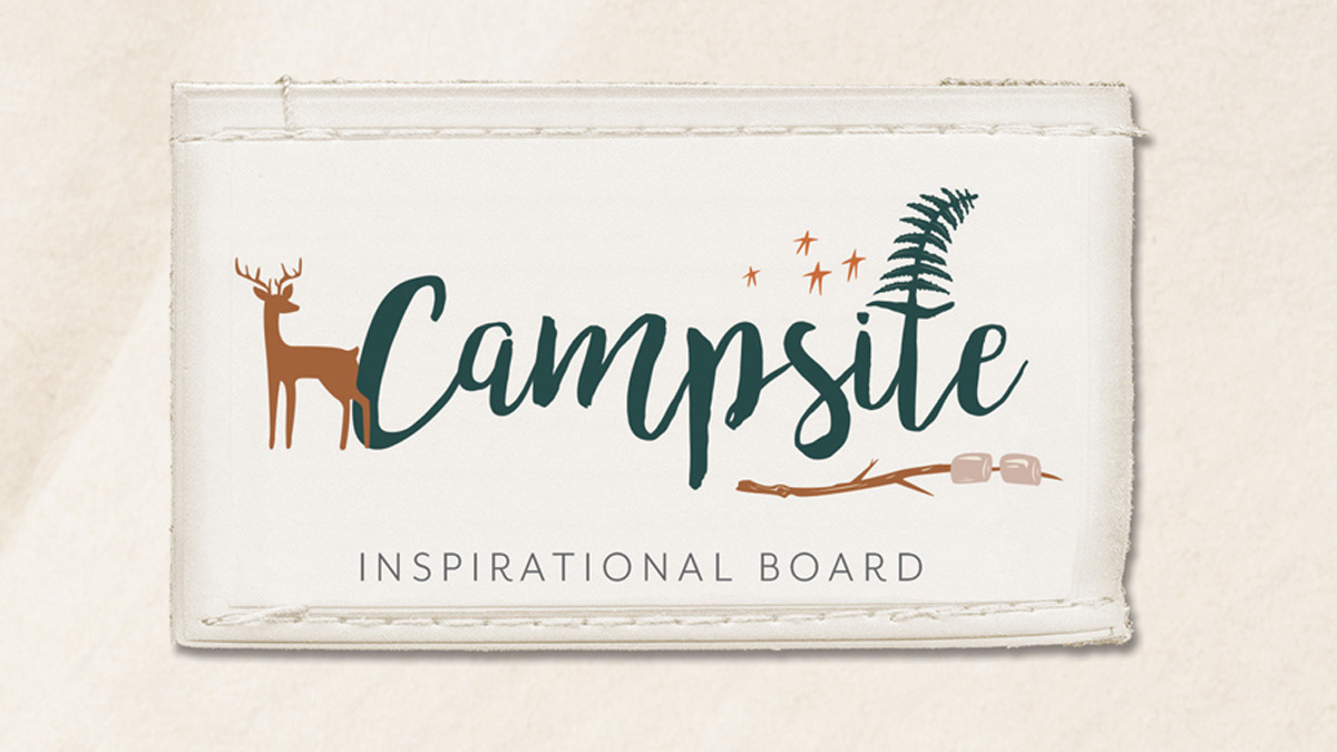
2018
Fabric Design Collection Sales Boards
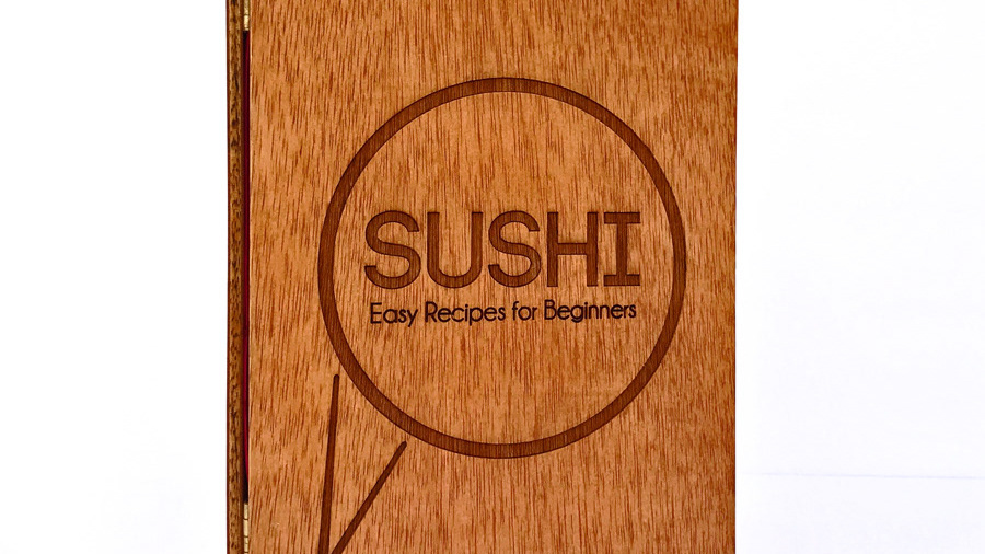
2014
Sushi Cookbook Handmade book
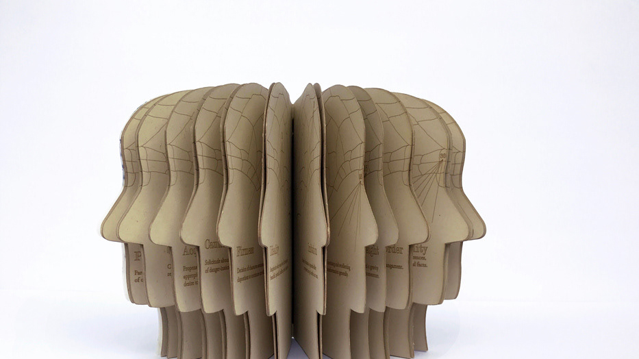
2014
Phrenology Handmade Book
2018
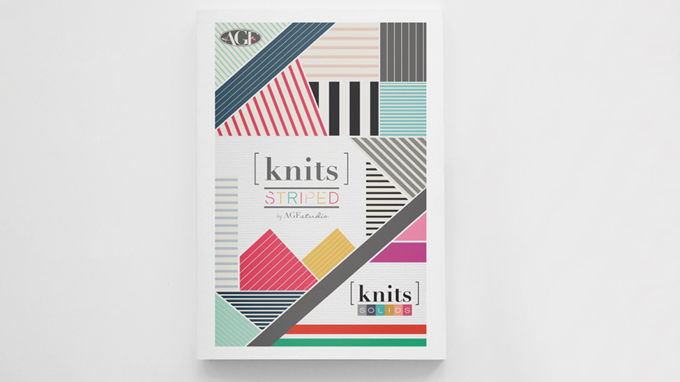
Fabric Collection Covers

2012
Free Style Magazine
2013
Pin & Go Brand Identity
2019
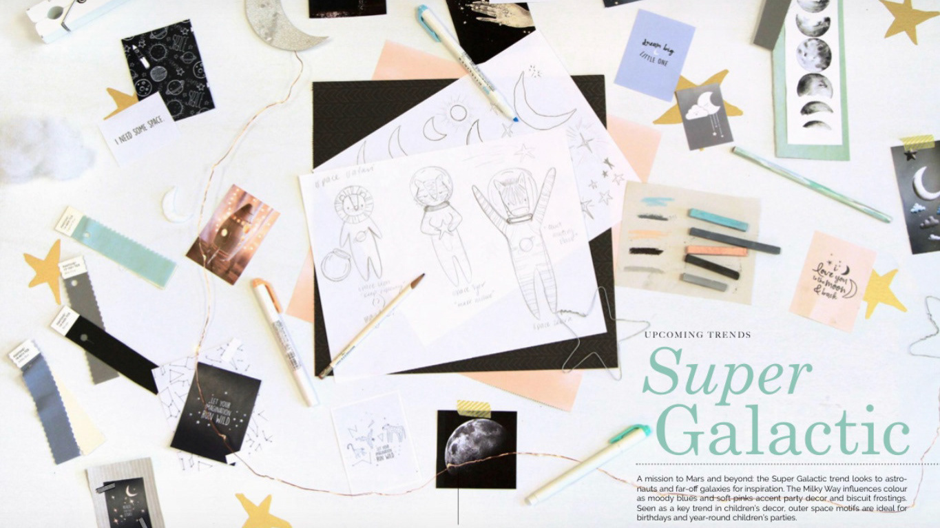
Fabric Collection Inspirational Boards
2018
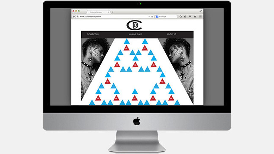
WEBSITE LAYOUT DESIGN
2015
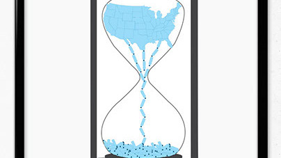
Awareness Poster
2014
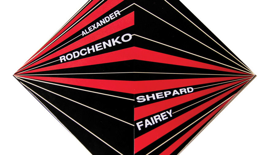
Alexander Rodchenko & Shepard Fairey Brochure
